top of page

Fedex Icon Redesign
What?
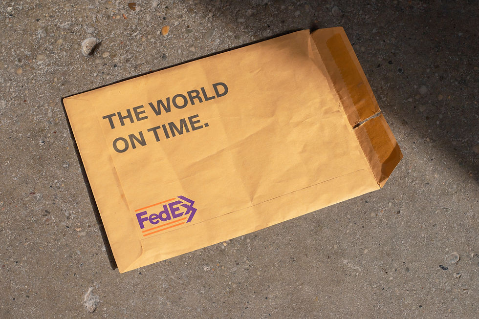
I redesigned the logo to focus on movement and delivery, and applied it across practical mockups such as delivery trucks, boxes, envelopes, and packaging to show consistent use across delivery touchpoints.
Why?
To visually represent the core function of delivery by communicating speed, direction, and reliability through the logo form.
Process
Developed a directional arrow concept to express forward motion, combined with parallel lines to suggest continuous flow and multiple delivery routes. Applied the logo across everyday delivery materials to test clarity, scalability, and consistency.
Made with: Adobe Illustrator and Photoshop


bottom of page